
Case study · Landing for an iOS app
An instant landing -
straight to the App Store.
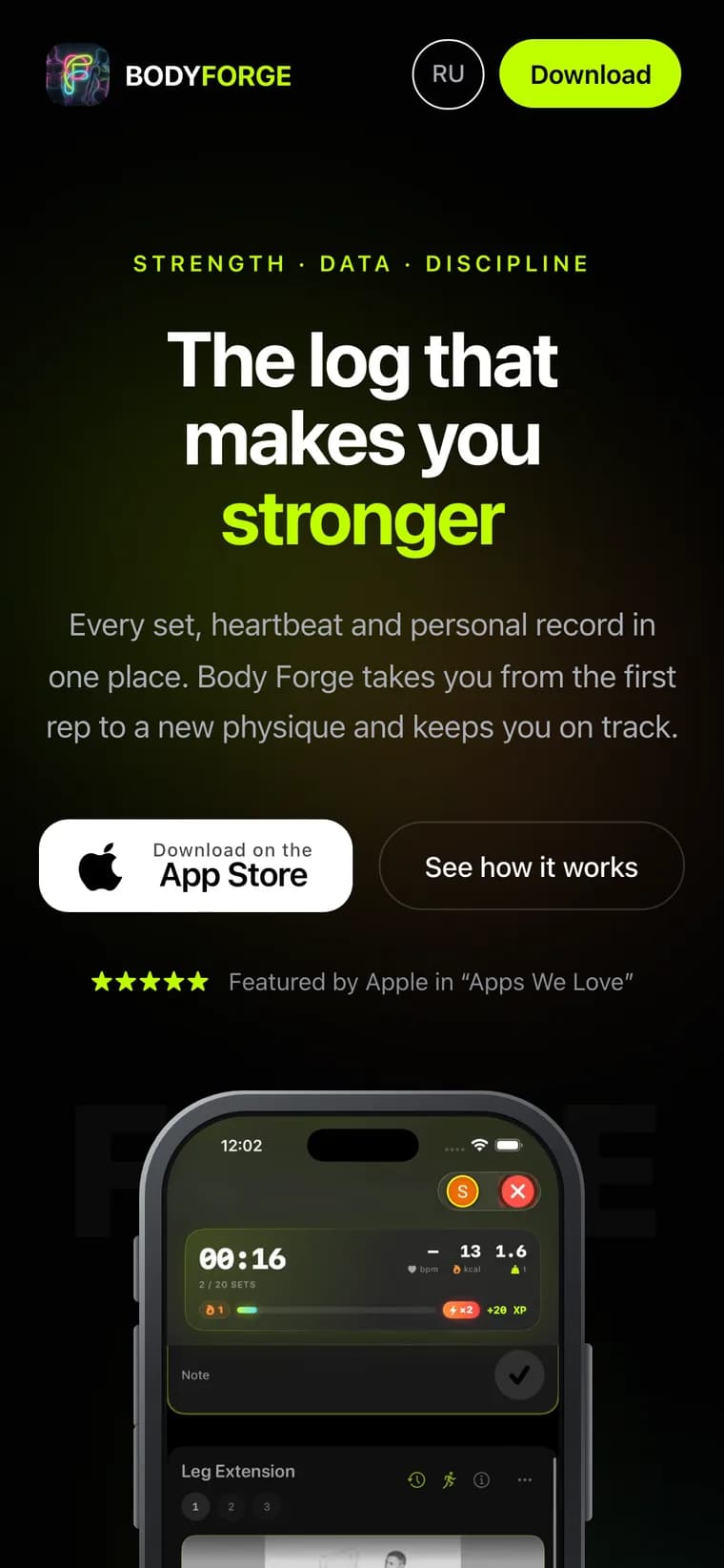
The app had only an App Store page and nowhere to send traffic. I built a dark, lime landing in the app's identity: RU + EN, first paint in 0.7s, one clear path - to the store. A blog and Schema.org bring organic traffic.
- RU · EN
- Two languages, hreflang
- 0.7 s
- To first paint
- 100%
- Responsive on phone
Problem
The app had an App Store page, but nowhere to send traffic. A store link doesn't explain how Body Forge beats a hundred other trackers, doesn't rank in search, and lives in one language. It needed its own site: short, fast and built in the app's own style, so anyone coming from an ad or a search grasps the value on the first screen and goes straight to install.
Solution
I built a dark landing page in the app's identity: black canvas, lime accent, oversized type. The first screen is a live workout screenshot and a single App Store button. Below it the scroll lays out the pieces - how the training loop works, the AI coach, the readiness system, the exercise library, programs and an FAQ, each animating in on scroll. The whole site ships in two languages (RU and EN) with correct hreflang and localized meta tags, its own blog for organic reach and Schema.org markup. Everything is static and light - the first screen is served in about 0.7 seconds.
Results
- Bilingual landing (RU + EN) with hreflang and localized meta tags
- First screen paints in ~0.7 s, full load under a second
- One clear path to the goal: from any block straight to the App Store
- Built-in blog and Schema.org markup working for organic search traffic
Site: bodyforges.com ↗
“I wanted the site to open instantly and speak the app's language. So - minimum weight, maximum character: black, lime and a single button.”
One site, two languages
The same landing - in Russian and English
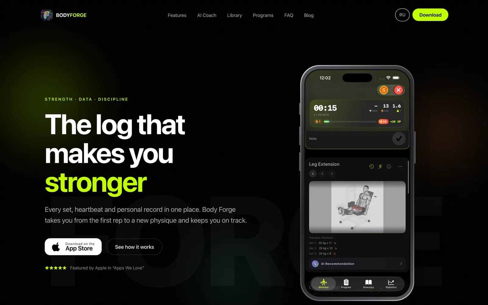
Flip the language and watch the whole screen change. Desktop and phone: one layout, two locales, correct hreflang on both.
RU + EN out of the box
Full translation, localized meta tags and hreflang - both versions are indexed as standalone pages.
First screen in ~0.7 s
Static delivery, a light start (~36 KB), animations that load only on scroll.
One goal: the install
Every block leads to a single App Store button. Nothing sits between interest and install.
How it works
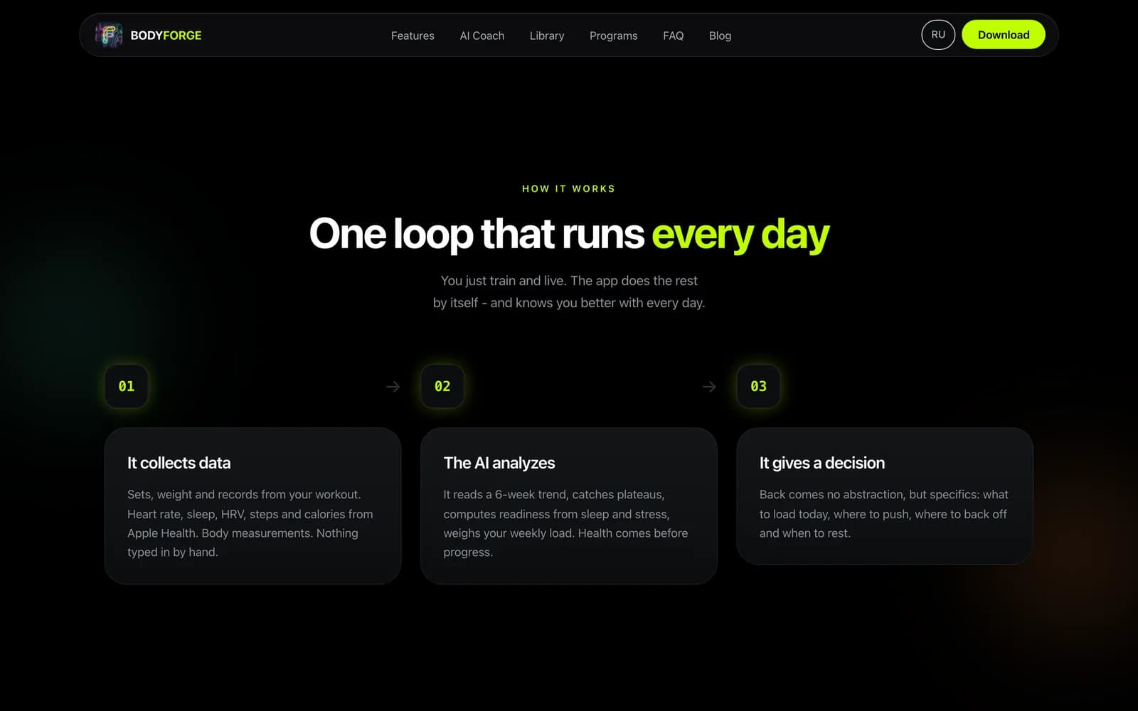
One loop that runs every day
Three steps - collect data, let the AI read it, get a decision - on a single screen.
Live workout
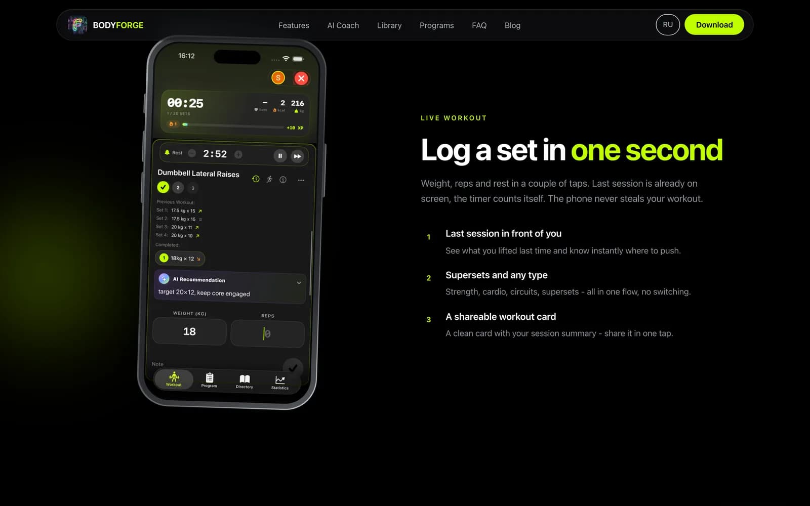
Log a set in one second
Last session and the timer are already on screen; the phone never steals the workout.
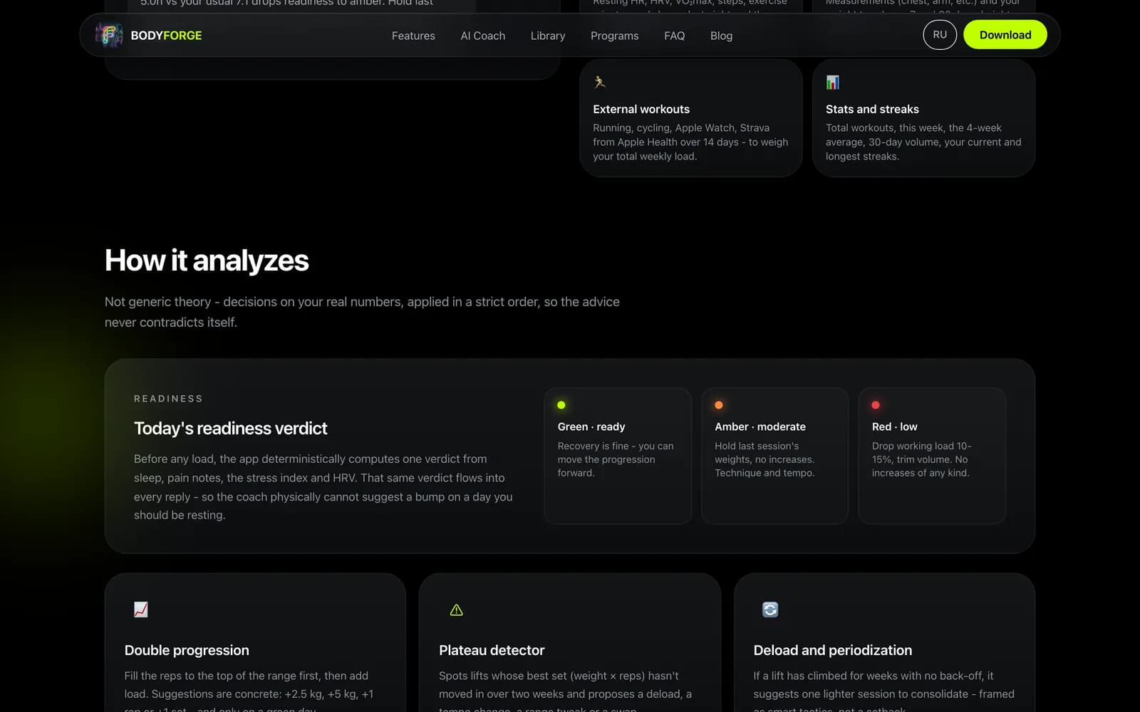
Readiness
Today's verdict: green, amber, red
The advice is built on real numbers - sleep, heart rate and weekly load.
30 minutes on a discovery call, and 24 hours later you have a fixed estimate.
- 30 mindiscovery call
- 24 hoursfixed estimate
- 0hidden invoices
No sales pitch - just a clear read on your scope.